Idemia Experience Portal
Enhancing Technical Websites with Scalable Illustrations

About
Jack Henry is an esteemed S&P 500 company catering to approximately 8,500 clients nationwide. Specializing in financial technology solutions and payment processing services, their primary clientele comprises community banks and credit unions. Jack Henry assists regional banks and credit unions in mitigating risk, fulfilling regulatory requirements, and enhancing their online banking services.
Seeking to consolidate their various brands into a unified entity, Jack Henry approached us for guidance in rebranding and redesigning their website.
Challenge
Jack Henry faced the challenge of managing four overlapping and conflicting brands, each with its own product-centric website. The primary challenge was to create a unified platform that seamlessly integrates all brands while maintaining a consistent and unique design.
Solution
We started by developing a new branding strategy for Jack Henry, emphasizing a warm, human-centered approach aligned with their "connect possibilities" brand positioning. This branding was blended with an innovative, high-tech feel to reflect Jack Henry's cutting-edge solutions.
To support this unified approach, we created a comprehensive digital design guideline and component guide. These resources provide clear directives for maintaining brand consistency and design integrity in future phases, ensuring the platform can evolve seamlessly while staying true to the new branding.
Redesign with Strong Visual Concept
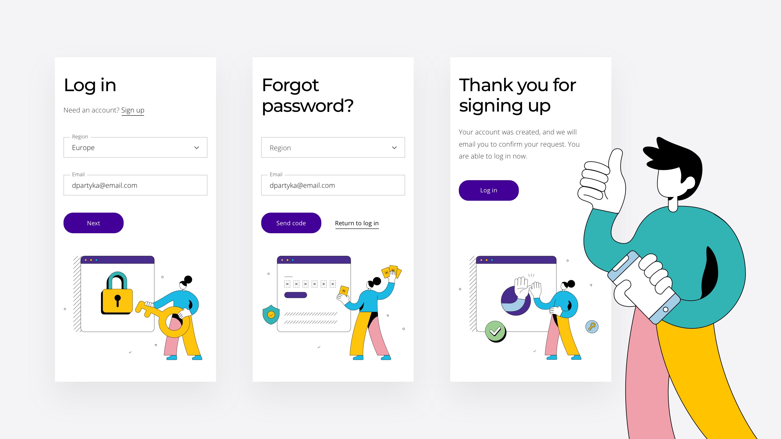
The old site had illustrations to help explain the content, but lacked a unique and consistent visual system. We offered abstract illustrations with an improved color palette to make them more eye-catching. Despite being content-heavy, the site now features stylized illustrations and iconography along with enhanced typographic hierarchy, greatly improving legibility and overall user experience.

Enhancing Content Readability: Infographic Design
From the previous brand color, where purple was the primary color, the site had over 20 colors without clear guidelines. We organized the color scheme, maintaining the same hues but using different shades by adjusting brightness and saturation. This limited and balanced color palette makes the new design pop. The abstract infographic style uses metaphors to better engage users, such as a caterpillar icon for the free version of the program and a butterfly for the upgraded paid version. This approach ensures consistency, visual appeal, and improved user engagement.
In each round of creation, we based our work on thorough research to deeply understand the content. We then translated this understanding into sketch illustrations that effectively conveyed the intended story. These sketches were refined into final illustrations in our unique style.


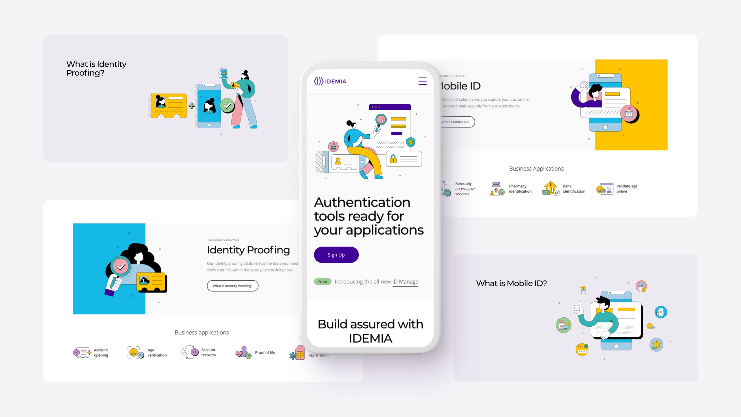
Responsive Illustration for Digital Usage
The site delves into various topics across different pages and sections, often revisiting the same subjects. To address this, we developed a responsive illustration system tailored for digital use. For instance, the mobile ID program appears on the homepage banner, a single overview page, and detailed explanation sections, each requiring different asset sizes. Instead of merely scaling down illustrations, which can pose accessibility issues, we created large detailed drawings, medium simplified illustrations, and small clean icons. This approach ensures optimal performance across the entire site, especially on smaller devices like mobile phones.


Design Guideline
We created a digital design guideline that maintains consistency with our infographic styles. This includes a light text style for paragraphs, complementing the headline style and matching our illustrations. Since the UI guidelines and illustration guidelines influence each other, we developed them together to ensure a cohesive look and feel. The simple, light style of the content pairs perfectly with our vibrant illustration style, creating a harmonious and engaging user experience.

Diagram Style with Better Readability
Following the establishment of both styles, we enhanced the diagram style to improve readability, facilitating easier comprehension for developers

Page Design
The page design strikes a harmonious balance, with headlines consistently heavier in weight than illustrations, guiding the eye to scan the text effortlessly. Pop colors like light blue and gold are sparingly used on a large scale. We crafted character styles featuring elongated arms, often holding tools like magnifying glasses or ID cards, to convey momentum and ease of access in problem-solving scenarios. Overall, the pages exude elegance, balance, and enjoyment.


The Result
We implemented breakpoints that function seamlessly across different devices, ensuring full responsiveness. All headlines are optimized for SEO purposes, contributing to enhanced visibility and searchability.
Please take a moment to visit the live site and experience the final outcome, which includes motion effects on individual illustrations.
